Backtesting Charts
Volatility’s backtesting charts allow you to intuitively visualize your backtesting results over historical data. The Backtester includes Expected Value, Equity Curve, Histogram, and Historical Option Strategy Pricing charts.
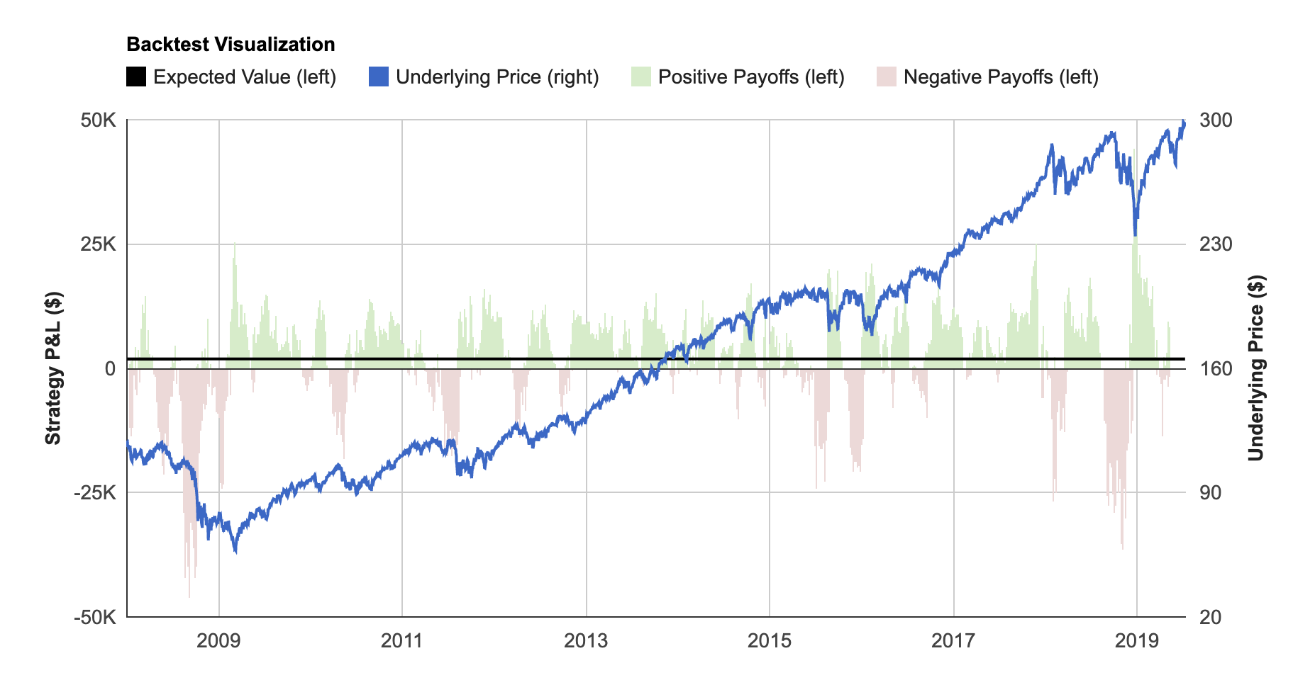
Backtest Visualization
The Backtest Visualization shows you each individual trade's performance in your backtest over time. On the left axis, green bars represent profitable historical trades, and red bars represent unprofitable historical trades. You can mouse over these bars to see the exact P&L (payoff) value along with the date the particular trade was initiated. The underlying price is also charted on the right axis to provide context for your backtesting payoffs. This chart helps you quickly understand under which market environments your strategy was profitable.
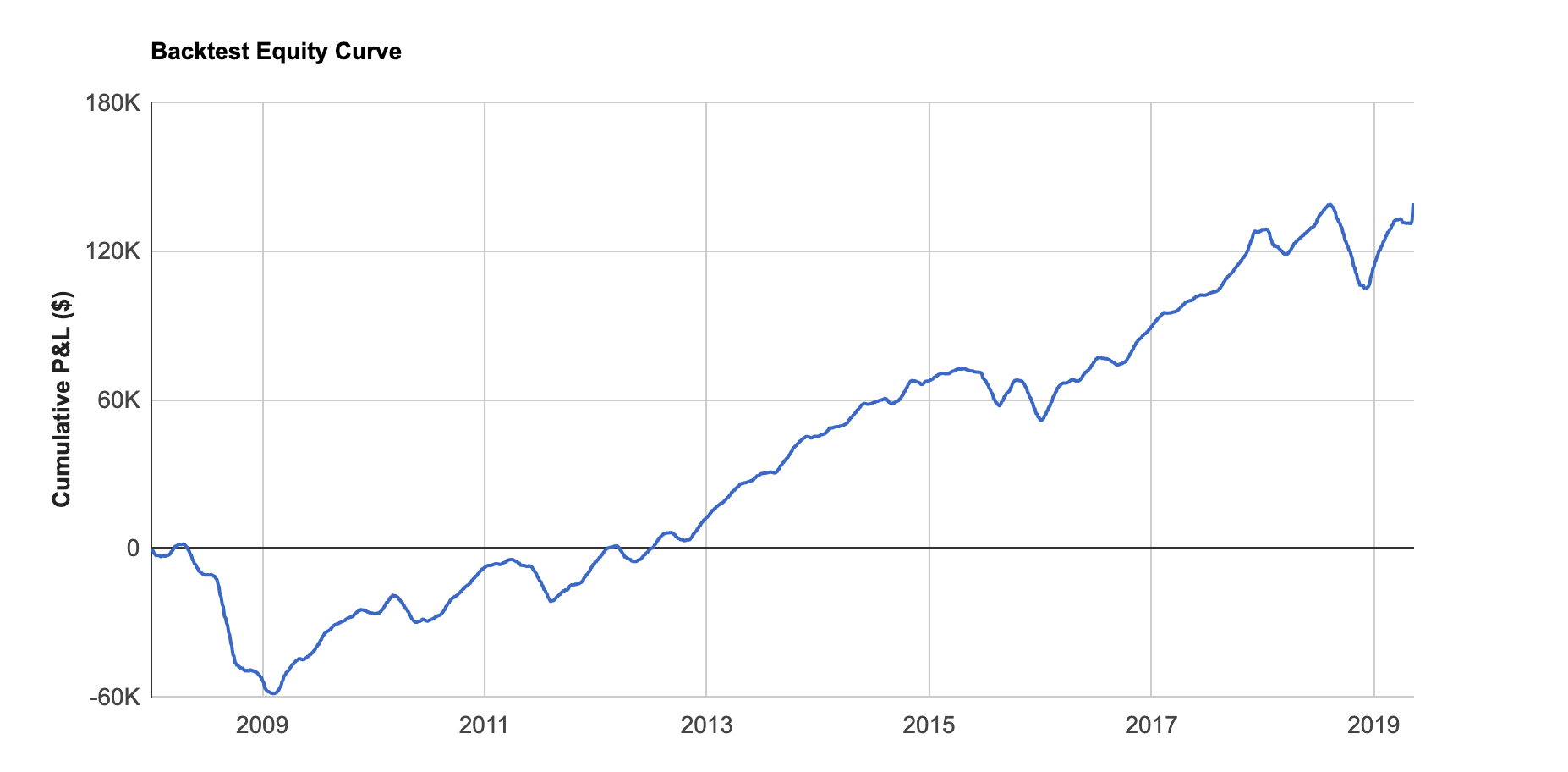
Equity Curve
The Equity Curve shows you cumulative backtested P&L for your strategy. It allows you to visualize how your strategy would have performed over time if perpetually traded through time. The backtest date range is split into sections based off of your holding period, and each trade outcome within each section is considered to have equal probability.
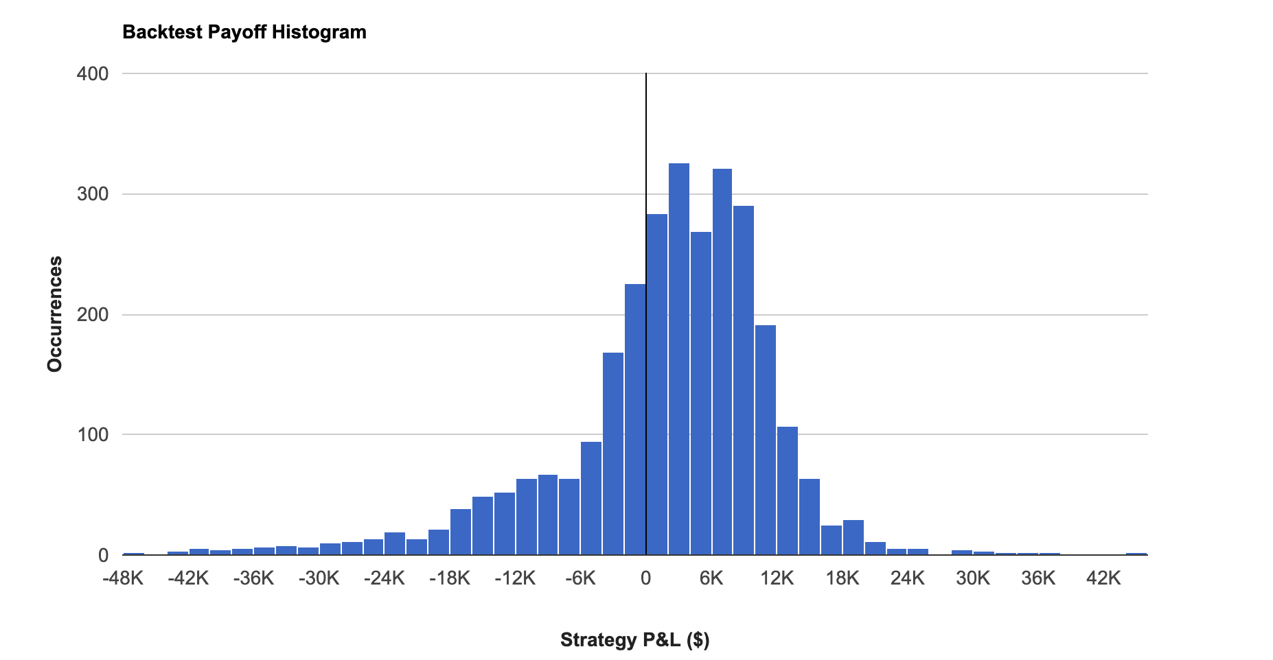
Histogram
The Histogram allows you to see the distribution of P&L outcomes for your backtested strategy. You can quickly determine if the strategy’s outcomes are clumped in certain payoff amounts or if outliers are skewing results.
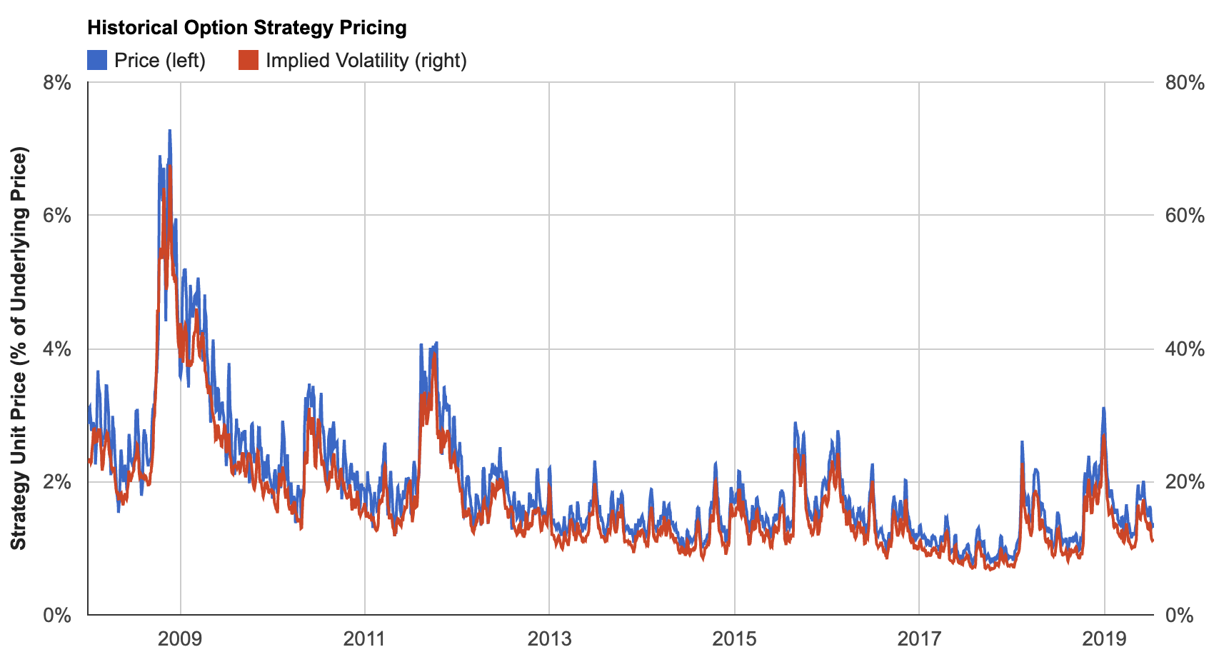
Historical Option Strategy Pricing
The Historical Option Strategy Pricing chart shows you how much your strategy would have cost to implement in the past and helps you determine whether it’s currently cheap or expensive. Both historical price and implied volatility are displayed.
The blue price line on the left axis shows you the strategy's net premium as a percentage of the underlying's price. For example, if your strategy costs $2.00 in premium to purchase today and the stock's price is $100, the blue price line would show a value of 2%. The red implied volatility line on the right axis shows the implied volatility of the options included in your options strategy. If all of the options are in the same direction, the red line will show the sum of the option leg implied volatilities. If the directions are different where you are purchasing one option and selling another, the red line will show the skew (or ratio) of the two implied volatilities.
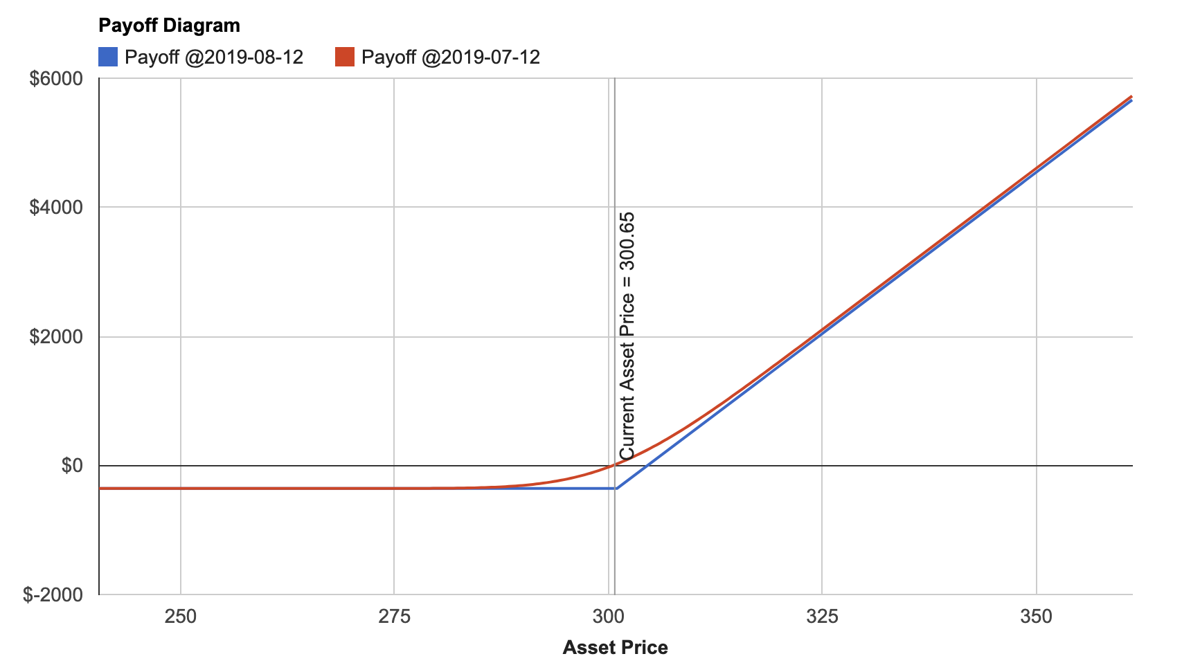
Payoff Diagram
Volatility’s Payoff Diagram is a simple way to visualize your P&L as the underlying’s price varies. The y-axis displays your P&L, and the x-axis displays the underlying asset’s price. Each line on the chart represents payoffs on a specific future date. The chart will show you P&Ls on your trade’s execution date and expiration date by default. You can add a custom date of your choosing by clicking the “Add Another Payoff Date” button.
Collectively, these five charts provide you with unprecedented insight into how your options strategy performs under different market conditions and help you make informed investment decisions.