Ratio charting: identify spread and relative value trades
07 Nov 2015We released a simple but powerful feature that allows you to very easily evaluate the relative cheapness or expensiveness of one option market against another. The Implied Volatility chart on every Market Overview page now has a toggle for “ratio charting.” Selecting this option will plot the ratio of one implied volatility against another.
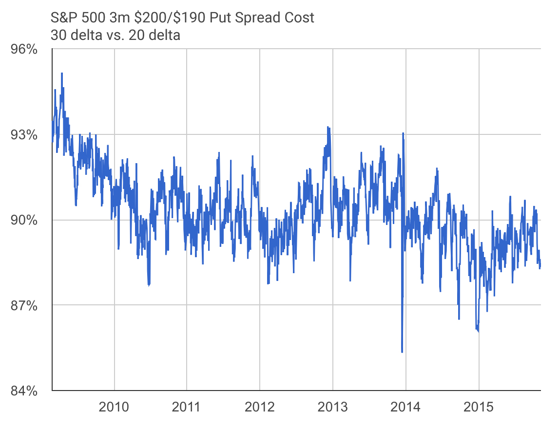
Two good use cases are put spreads and call spreads. For example, when buying a put spread, one would generally want implied volatility on the bought put to be low relative to the sold put as that means they’re collecting more premium for the trade. The chart below shows the ratio between those vols for a three month $200/$190 put spread on the S&P 500 (SPY). The ratio is near its lowest point over the past seven years, showing that the sold put (20 delta) is unusually expensive compared to the bought put (30 delta) and that the put spread as a whole is historically cheap. This feature makes it easy to find cheap spreads to buy and expensive spreads to sell.
This same analysis can be used for selling spreads and can be extended to multiple underliers. For example, you could very easily chart the relative cheapness of S&P 500 options against Nasdaq options. Try it out!